Tutorial 02 (Solutions)
André Victor Ribeiro Amaral
Introduction
For this problem set, we will use the following libraries
library(tidyverse)
library(lubridate)
library(zoo)
library(rgeoboundaries)
library(patchwork)
library(viridis)
Throughout the tutorial, consider the following scenario. Let \(\{y_{it}; i = 1, \cdots, I; t = 1, \cdots, T\}\) denotes a multivariate time series of disease counts in each Saudi Arabia region, such that \(I = 13\) refers to the number of considered regions and \(T = 36\) to the length of the time series. In particular, we will model \(Y_{it}|Y_{i,(t-1)} = y_{i,(t-1)} \sim \text{Poisson}(\lambda_{it})\), such that \(\log(\lambda_{it}) = \beta_0 + e_{i} + \beta_1 \cdot t + \beta_2 \cdot \sin(\omega t) + \beta_3 \cdot \cos(\omega t)\), where \(e_i\) corresponds to the population fraction in region \(i\) and \(\omega = 2\pi / 12\). Also, we have information about the population size and proportion of men in each region, as well as the number of deaths linked to each element of the \(\{y_{it}\}_{it}\) series.
You can download the .csv file here. And you read the file and convert it to a tibble object in the following way
data <- readr::read_csv(file = 'others/r4ds.csv')## Rows: 468 Columns: 6
## ── Column specification ────────────────────────────────────────────────────────
## Delimiter: ","
## chr (1): region
## dbl (4): n_cases, pop, men_prop, n_deaths
## date (1): date
##
## ℹ Use `spec()` to retrieve the full column specification for this data.
## ℹ Specify the column types or set `show_col_types = FALSE` to quiet this message.head(data, 5)## # A tibble: 5 × 6
## date region n_cases pop men_prop n_deaths
## <date> <chr> <dbl> <dbl> <dbl> <dbl>
## 1 2018-01-01 Eastern 33 4105780 0.403 3
## 2 2018-01-01 Najran 23 505652 0.486 1
## 3 2018-01-01 Northern Borders 30 320524 0.666 6
## 4 2018-01-01 Ha’il 36 597144 0.601 3
## 5 2018-01-01 Riyadh 38 6777146 0.559 6The code to generated such a data set can be found here.
Problem 01
Now, to manipulate our data set, we will use the dplyr package. From its documentation, we can see that there are 5 main methods, namely, mutate(), select(), filter(), summarise(), and arrange(). . We will use them all.
- Start by selecting the
date,region, andn_casesfrom our original data set. To do this, use the pipe operator%>%(inRStudio, you may use the shortcutCtrl + Shift + M).
data %>% select(date, region, n_cases) %>% head(3)## # A tibble: 3 × 3
## date region n_cases
## <date> <chr> <dbl>
## 1 2018-01-01 Eastern 33
## 2 2018-01-01 Najran 23
## 3 2018-01-01 Northern Borders 30# Alternatively,
# data %>% select(-pop, -men_prop, -n_deaths) %>% head(3)
# data %>% select(date:n_cases) %>% head(3)- Using
?tidyselect::select_helpers, one may find useful functions that can be combined withselect(). For instance, select all columns that start with “n_”.
data %>% select(starts_with('n_')) %>% head(3)## # A tibble: 3 × 2
## n_cases n_deaths
## <dbl> <dbl>
## 1 33 3
## 2 23 1
## 3 30 6- Aiming to obtain more meaningful sliced data sets, use the
filter()andselect()functions to select the the dates and regions for which the number of cases is greater than 40.
data %>% filter(n_cases > 30) %>% select(date, region) %>% head(3)## # A tibble: 3 × 2
## date region
## <date> <chr>
## 1 2018-01-01 Eastern
## 2 2018-01-01 Ha’il
## 3 2018-01-01 Riyadh- Also, select the date, name of the region, number of cases, and number of deaths for which the region is Eastern or Najran
ANDthe date is greater than2019-01-01(you may want to use thelubridatepackage to deal with dates).
data %>% filter(region %in% c('Eastern', 'Najran'), date > ymd('2019-01-01')) %>%
  select(date, region, n_cases, n_deaths) %>% head(3)
## # A tibble: 3 × 4
## date region n_cases n_deaths
## <date> <chr> <dbl> <dbl>
## 1 2019-02-01 Eastern 26 7
## 2 2019-02-01 Najran 2 0
## 3 2019-03-01 Eastern 83 13- Now, select the date, name of the region, number of cases, and number of deaths for which the number of cases is larger than
700ORthe number of deaths is equal to10and arrange, in a descending order forn_cases, the results.
data %>% filter(n_deaths == 10 | n_cases > 700) %>%
  select(date, region, n_cases, n_deaths) %>% arrange(desc(n_cases)) %>% head(3)
## # A tibble: 3 × 4
## date region n_cases n_deaths
## <date> <chr> <dbl> <dbl>
## 1 2018-05-01 Mecca 792 93
## 2 2018-05-01 Riyadh 719 121
## 3 2019-05-01 Ha’il 94 10- Finally, using the
mutate()function, create a new column into the original data set that shows the cumulative sum for the number of deaths (and name itcum_deaths), and select the number of deaths and this newly created column.
data %>% mutate(cum_deaths = cumsum(n_deaths)) %>%
  select(ends_with('deaths')) %>% head(3)
## # A tibble: 3 × 2
## n_deaths cum_deaths
## <dbl> <dbl>
## 1 3 3
## 2 1 4
## 3 6 10Remark: cummin(), cummax(), cummean(), lag(), etc. are examples of functions that can be used with mutate().
- Using the
lag()anddrop_na()functions, create a new column namedn_cases_lag2and another one namedn_deaths_lag3that are copies ofn_casesandn_deathsbut with lags 2 and 3, respectively. Then, drop the rows withNAs in then_cases_lag2column and select all but thedateandregioncolumns.
data %>% mutate(n_cases_lag2 = lag(n_cases, 2),
                n_deaths_lag3 = lag(n_deaths, 3)) %>%
  drop_na(n_cases_lag2) %>%
  select(-date, -region) %>%
  head(3)
## # A tibble: 3 × 6
## n_cases pop men_prop n_deaths n_cases_lag2 n_deaths_lag3
## <dbl> <dbl> <dbl> <dbl> <dbl> <dbl>
## 1 30 320524 0.666 6 33 NA
## 2 36 597144 0.601 3 23 3
## 3 38 6777146 0.559 6 30 1- Now, the goal is work with the
group_by()function. To do this, group the data set by region, and select the three first columns.
data %>% group_by(region) %>% select(1:3) %>% head(3)## # A tibble: 3 × 3
## # Groups: region [3]
## date region n_cases
## <date> <chr> <dbl>
## 1 2018-01-01 Eastern 33
## 2 2018-01-01 Najran 23
## 3 2018-01-01 Northern Borders 30- Combining a few different functions, select all but the
popcolumn and create a new one (namednorm_cases) that shows the normalized number of cases by date.
data %>% group_by(date) %>%
  mutate(norm_cases = n_cases/sum(n_cases),
         cumsum = cumsum(norm_cases)) %>%
  select(-pop) %>%
  head(14)
## # A tibble: 14 × 7
## # Groups: date [2]
## date region n_cases men_prop n_deaths norm_cases cumsum
## <date> <chr> <dbl> <dbl> <dbl> <dbl> <dbl>
## 1 2018-01-01 Eastern 33 0.403 3 0.0862 0.0862
## 2 2018-01-01 Najran 23 0.486 1 0.0601 0.146
## 3 2018-01-01 Northern Borders 30 0.666 6 0.0783 0.225
## 4 2018-01-01 Ha’il 36 0.601 3 0.0940 0.319
## 5 2018-01-01 Riyadh 38 0.559 6 0.0992 0.418
## 6 2018-01-01 Asir 21 0.444 4 0.0548 0.473
## 7 2018-01-01 Mecca 40 0.302 9 0.104 0.577
## 8 2018-01-01 Tabuk 33 0.347 7 0.0862 0.663
## 9 2018-01-01 Medina 29 0.263 3 0.0757 0.739
## 10 2018-01-01 Qasim 14 0.373 2 0.0366 0.775
## 11 2018-01-01 Al Bahah 34 0.593 9 0.0888 0.864
## 12 2018-01-01 Jizan 33 0.386 4 0.0862 0.950
## 13 2018-01-01 Al Jawf 19 0.298 3 0.0496 1
## 14 2018-02-01 Eastern 67 0.403 10 0.0860 0.0860- Using the
summarise()(orsummarize()) function, get the average and variance for the variablesn_casesandn_deaths, as well as the total number of rows.
data %>% select(n_cases, n_deaths) %>%
  summarize(mean_n_cases = mean(n_cases, na.rm = TRUE),
            var_n_cases = var(n_cases, na.rm = TRUE),
            mean_n_deaths = mean(n_deaths, na.rm = TRUE),
            var_n_deaths = var(n_deaths, na.rm = TRUE), n = n())
## # A tibble: 1 × 5
## mean_n_cases var_n_cases mean_n_deaths var_n_deaths n
## <dbl> <dbl> <dbl> <dbl> <int>
## 1 63.9 11830. 9.76 294. 468- You will notice that the results from the above item do not seem very impressive. However, we can combine
summarize()withgroup_by()to get more meaningful statistics. For instance, obtain similar results as before, but for each region.
data %>% group_by(region) %>%
  select(n_cases, n_deaths) %>%
  summarize(mean_n_cases = mean(n_cases, na.rm = TRUE),
            var_n_cases = var(n_cases, na.rm = TRUE),
            mean_n_deaths = mean(n_deaths, na.rm = TRUE),
            var_n_deaths = var(n_deaths, na.rm = TRUE), n = n())
## Adding missing grouping variables: `region`## # A tibble: 13 × 6
## region mean_n_cases var_n_cases mean_n_deaths var_n_deaths n
## <chr> <dbl> <dbl> <dbl> <dbl> <int>
## 1 Al Bahah 39.7 4043. 7.44 221. 36
## 2 Al Jawf 39.9 2953. 5.83 91.8 36
## 3 Asir 54.5 4383. 8.94 142. 36
## 4 Eastern 84.2 11258. 12.6 245. 36
## 5 Ha’il 47.3 4685. 8.58 258. 36
## 6 Jizan 55.0 5881. 9.39 236. 36
## 7 Mecca 185. 49857. 26.9 1150. 36
## 8 Medina 49.0 6594. 6.81 141. 36
## 9 Najran 33.3 2260 5.56 78.4 36
## 10 Northern Borders 36.6 3947. 5.58 108. 36
## 11 Qasim 37.6 3111. 5.28 65.2 36
## 12 Riyadh 126. 30390. 17.1 600. 36
## 13 Tabuk 42.4 4215. 6.92 119. 36- And as in
SQL, intidyverse, there are also functions that make joining two tibbles possible. From the documentation page, we haveinner_join(),left_join,right_join()andfull_join(). As an example, consider the following data set, which shows the (fake) mean temperature (in Celsius) in almost all regions and studied months in Saudi Arabia. Assuming the previous data set is indata,
set.seed(0)
n <- (nrow(data) - 3)
new_data <- tibble(id = 1:n, date = data$date[1:n], region = data$region[1:n], temperature = round(rnorm(n, 30, 2), 1))
new_data
## # A tibble: 465 × 4
## id date region temperature
## <int> <date> <chr> <dbl>
## 1 1 2018-01-01 Eastern 32.5
## 2 2 2018-01-01 Najran 29.3
## 3 3 2018-01-01 Northern Borders 32.7
## 4 4 2018-01-01 Ha’il 32.5
## 5 5 2018-01-01 Riyadh 30.8
## 6 6 2018-01-01 Asir 26.9
## 7 7 2018-01-01 Mecca 28.1
## 8 8 2018-01-01 Tabuk 29.4
## 9 9 2018-01-01 Medina 30
## 10 10 2018-01-01 Qasim 34.8
## # … with 455 more rowsNotice that there is a column named id on new_data. We will need it to link the new tibble to the old one. Thus, let’s create a similar column in data.
data <- data %>% add_column(id = 1:(nrow(data))) %>% select(c(7, 1:6))
head(data, 1)
## # A tibble: 1 × 7
## id date region n_cases pop men_prop n_deaths
## <int> <date> <chr> <dbl> <dbl> <dbl> <dbl>
## 1 1 2018-01-01 Eastern 33 4105780 0.403 3Now, we can incorporate the new data into the original tibble by using, for example, the left_join() function.
data %>% left_join(new_data %>% select(id, temperature), by = 'id') %>%
  tail(1)
## # A tibble: 1 × 8
## id date region n_cases pop men_prop n_deaths temperature
## <int> <date> <chr> <dbl> <dbl> <dbl> <dbl> <dbl>
## 1 468 2020-12-01 Al Jawf 2 440009 0.298 0 NAProblem 02
For this problem, we will use ggplot2 to produce different plots.
- But before, from the original data set, create an object that contains the columns
date,region,n_men,n_women,n_cases, andn_deaths, such thatn_menandn_womencorrespond to the number of men and the number of women, respectively (to do this, recall thatmen_proprepresents the proportion of men in the population for a given region).
data <- data %>% mutate(women_prop = 1 - men_prop) %>%
          mutate(n_men = pop * men_prop) %>%
          mutate(n_women = pop * women_prop) %>%
          select(date, region, n_men, n_women, n_cases, n_deaths)
head(data, 7)
## # A tibble: 7 × 6
## date region n_men n_women n_cases n_deaths
## <date> <chr> <dbl> <dbl> <dbl> <dbl>
## 1 2018-01-01 Eastern 1654276. 2451504. 33 3
## 2 2018-01-01 Najran 245548. 260104. 23 1
## 3 2018-01-01 Northern Borders 213622. 106902. 30 6
## 4 2018-01-01 Ha’il 358851. 238293. 36 3
## 5 2018-01-01 Riyadh 3785117. 2992029. 38 6
## 6 2018-01-01 Asir 850468. 1062924. 21 4
## 7 2018-01-01 Mecca 2086623. 4828383. 40 9- Now, the main goal is visualize the studied data set. To do this, we will mainly rely on the
ggplot2library, which is also included in thetidyverseuniverse. Start by creating a line chart for the number of cases in each region (all in the same plot) over the months (when I tried to plot it in myRMarkdowndocument, I had problems with theHa’ilname. If the same happens to you, try to replace it byHail). Mapregiontocolor.
data <- data %>% mutate(region = replace(region, region == 'Ha’il', 'Hail'))ggplot(data = data,
mapping = aes(x = date, y = n_cases, color = region)) +
geom_line() +
theme_bw() +
labs(x = 'Date', y = 'Number of Cases', color = 'Region') +
theme(text = element_text(family = 'LM Roman 10'))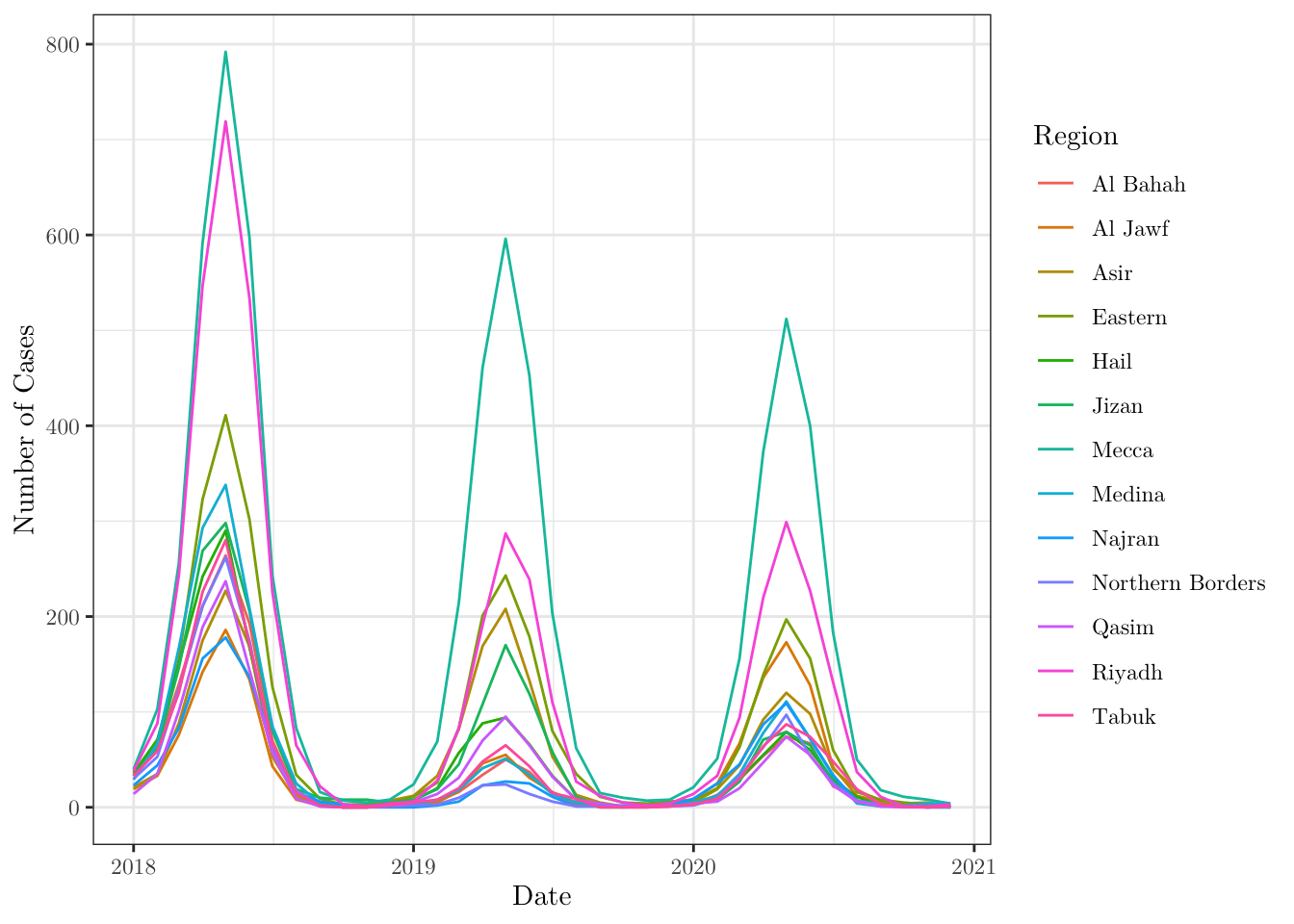
- When plotting, we can also map more than one property at a time. For instance, plot a dot chart for the number of cases in each region over months that maps
regiontocolorandn_deathstosize.
ggplot(data = data,
       mapping = aes(x = date, y = n_cases, size = n_deaths, color = region)) +
  geom_point() +
  theme_bw() +
  labs(x = 'Date', y = 'Number of Cases', color = 'Region', size = 'N. Deaths') +
  theme(text = element_text(family = 'LM Roman 10'))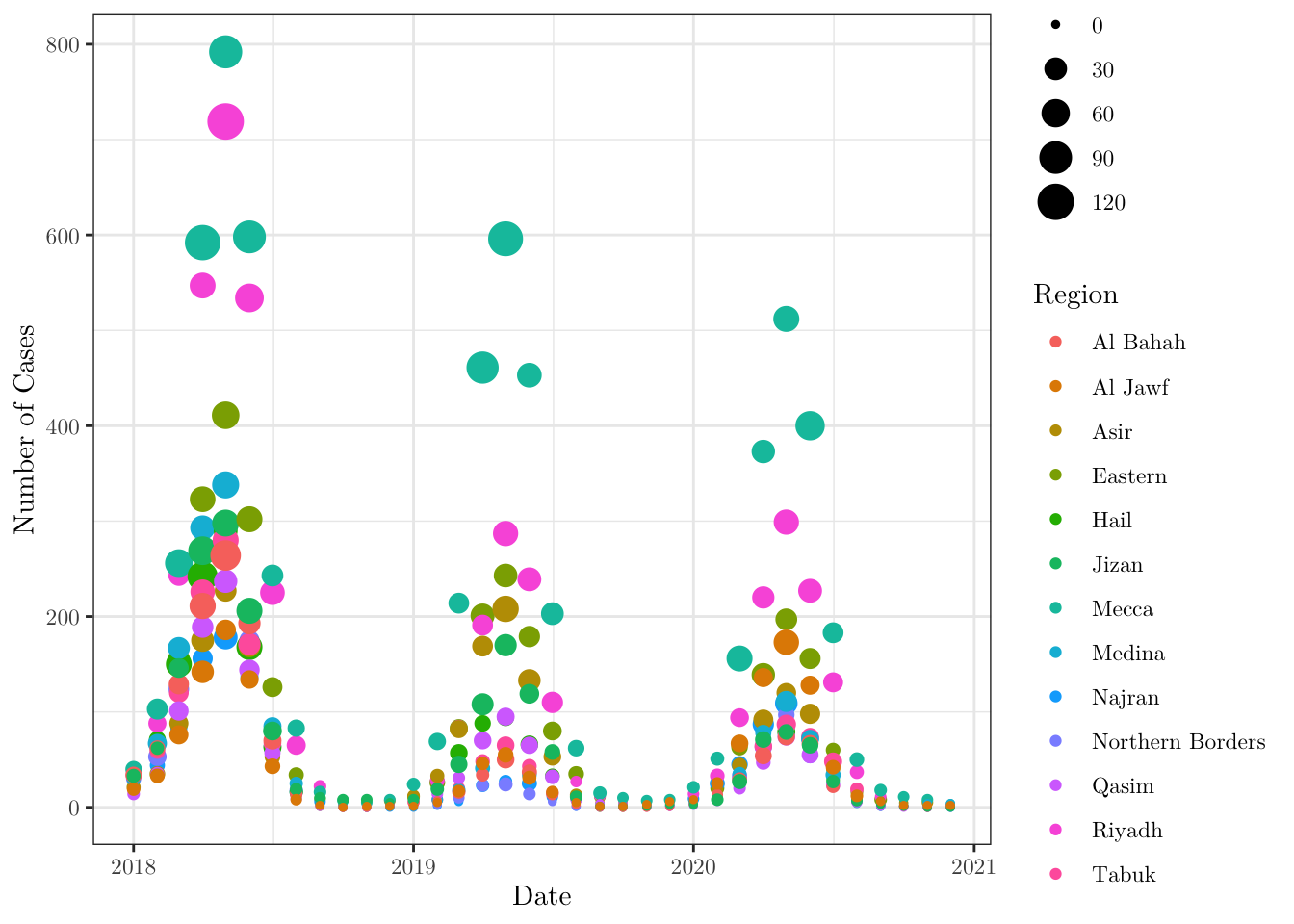
- Now, using the function
rollmean()from thezoopackage, plot the number of cases in Mecca (notice that you will have to filter your data set) over time and the moving average (with window \(\text{k} = 3\)) of the same time series.
ggplot(data = data,
       mapping = aes(x = date, y = n_cases)) +
  geom_line(data = . %>% filter(region == 'Mecca'), aes(color = 'light_red')) +
  geom_line(data = . %>% filter(region == 'Mecca'),
            aes(y = rollmean(x = n_cases,
                             k = 3,
                             align = 'right',
                             fill = NA),
                color = 'solid_red')) +
  theme_bw() +
  labs(x = 'Date', y = 'Number of Cases',
       title = 'Number of cases in Mecca (with moving average for k = 3)') +
  scale_color_manual(name = 'Number of cases (Mecca)',
                      values = c('light_red' = alpha('red', 0.25),
                                 'solid_red' = alpha('red', 1.00)),
                      labels = c('Original data', 'Moving average')) +
  theme(text = element_text(family = 'LM Roman 10'))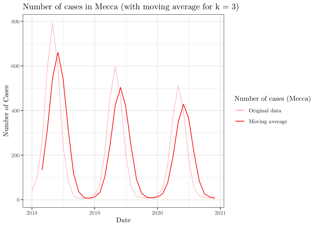
Now, we will plot the map of Saudi Arabia divided into the given regions. To do this, we will need to work with a shapefile for the boundaries of the Kingdom. This type of file may be found online. However, there are some R packages that provide such data. For instance, we can use the geoboundaries('Saudi Arabia', adm_lvl = 'adm1') function from the rgeoboundaries package to obtain the desired data set.
After downloading the data, you can plot it using the ggplot(data) + geom_sf() functions (depending on what you are trying to do, you may have to install (and load) the sp and/or sf libraries).
KSA_shape <- geoboundaries('Saudi Arabia', adm_lvl = 'adm1')
KSA_shape$shapeName <- data$region[1:13]
ggplot(data = KSA_shape) +
  geom_sf() +
  geom_sf_label(aes(label = shapeName)) +
  theme_bw() +
  labs(x = 'Longitude', y = 'Latitude', title = 'Map of Saudi Arabia') +
  theme(text = element_text(family = 'LM Roman 10'))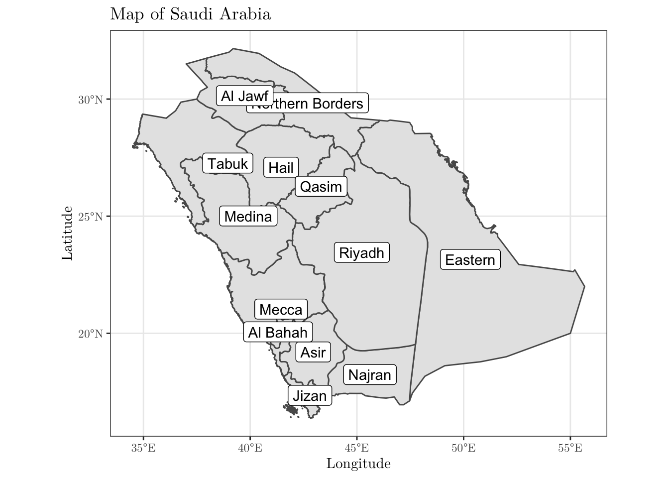
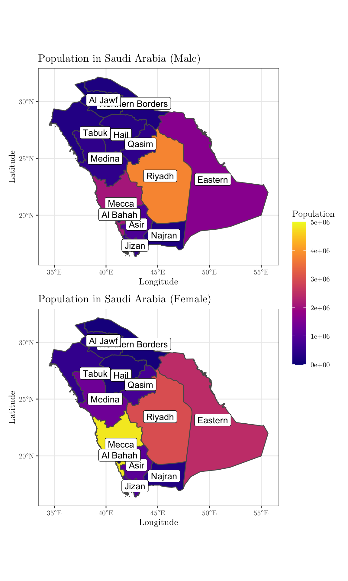
- As a final task, plot two versions of the above map side-by-side. On the left, the colors should represent the population size for men in each region; similarly, on the right, the population size for women (to combine plots in this way, you may want to use the
patchworkpackage. And for different colour palettes, you may use theviridispackage). Use the same scale, so that the values are comparable.
KSA_shape$n_men <- data$n_men[1:13]
KSA_shape$n_women <- data$n_women[1:13]
min_pop = 0      # min(c(KSA_shape$n_men, KSA_shape$n_women))
max_pop = 5e+06  # max(c(KSA_shape$n_men, KSA_shape$n_women))
men <- ggplot(data = KSA_shape) +
       geom_sf(aes(fill = n_men)) +
       scale_fill_viridis(limits = c(min_pop, max_pop), name = 'Population',
                          option = 'plasma') +
       geom_sf_label(aes(label = shapeName)) +
       theme_bw() +
       labs(x = 'Longitude', y = 'Latitude',
            title = 'Population in Saudi Arabia (Male)') +
       theme(text = element_text(family = 'LM Roman 10'))
women <- ggplot(data = KSA_shape) +
         geom_sf(aes(fill = n_women)) +
         scale_fill_viridis(limits = c(min_pop, max_pop), name = 'Population',
                            option = 'plasma') +
         geom_sf_label(aes(label = shapeName)) +
         theme_bw() +
         labs(x = 'Longitude', y = 'Latitude',
              title = 'Population in Saudi Arabia (Female)') +
         theme(text = element_text(family = 'LM Roman 10'))
combined <- men + women  + plot_layout(guides = 'collect', ncol = 1) &
              theme(legend.position = 'right', legend.key.height = unit(1.25, 'cm'))
print(combined)